The secret to the perfect colour and
material palette in interior design
An Interview with Jesseca van Haneghem, Studio Piet Boon
Material and color usage play a crucial role in interior design and are essential in FORMANI's palette development. We leverage our experience to create strong color palettes, identifying and utilizing sustainable color trends in architectural hardware early on. This is achieved by closely listening to architects and interior designers.
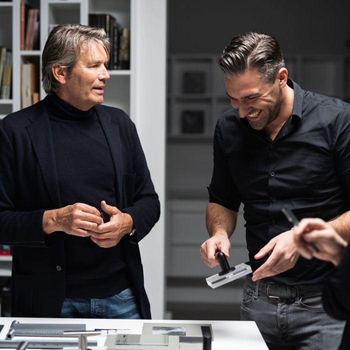
In this context, we spoke with Jesseca van Haneghem, Designer/Senior Specialist Material & Product at Studio Piet Boon, a renowned design firm and creator of four of our iconic hardware collections. Jesseca is primarily responsible for color and material choices. In this blog, you will learn about her professional insights and our perspectives as a manufacturer in this field.

The Importance of a Thoughtful Color Palette at Studio Piet Boon and FORMANI
As the one in charge of color and material choices in our interior projects, Jesseca van Haneghem works closely with other designers, each with their own expertise. Jesseca's specialty is 'color selection,' a process crucial to the success of every project. This requires careful consideration of factors such as the building's architecture, room layout, light entry, surroundings, and client preferences, which can vary greatly. We view palette creation as an essential and indispensable part of design.
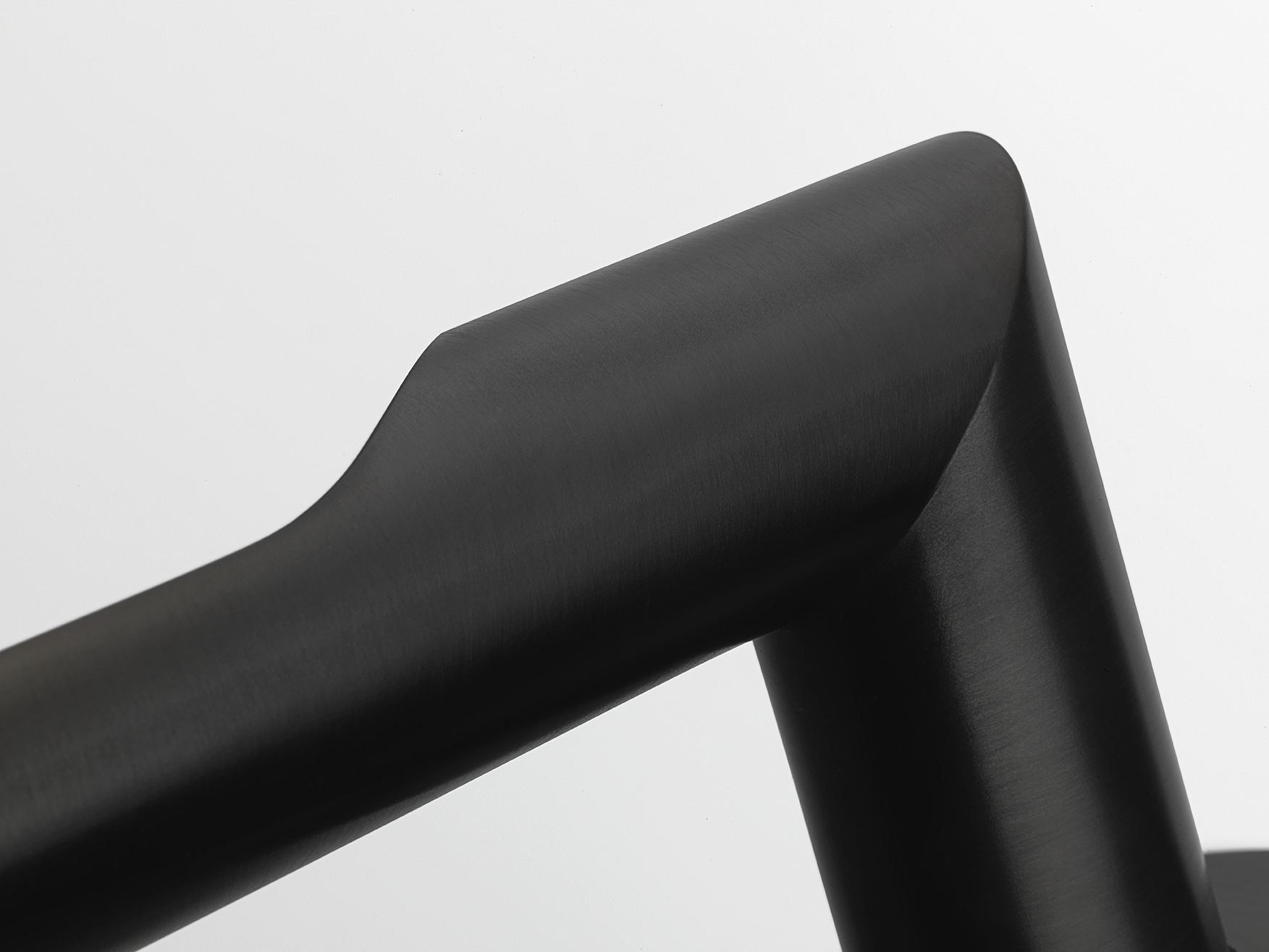
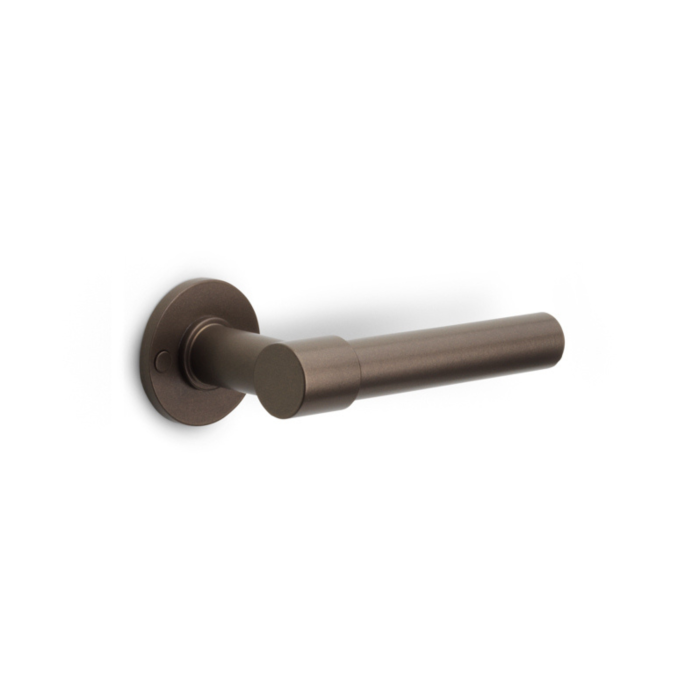
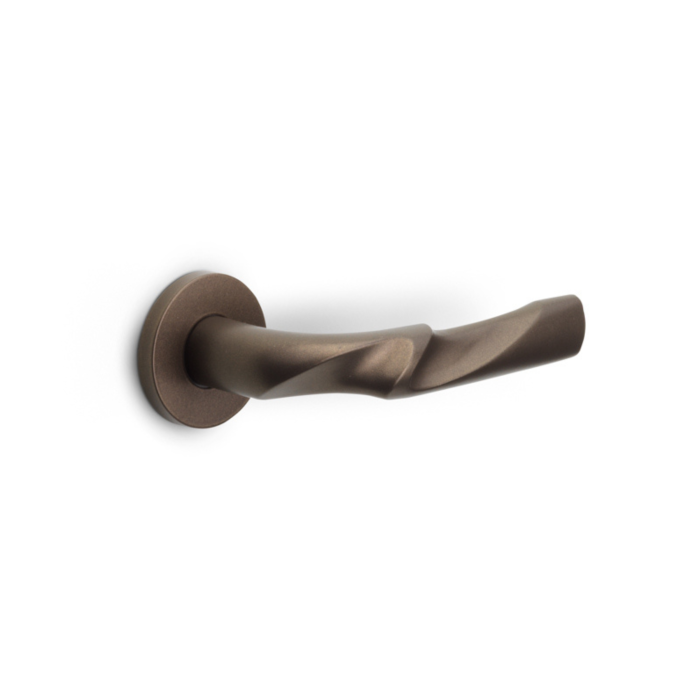
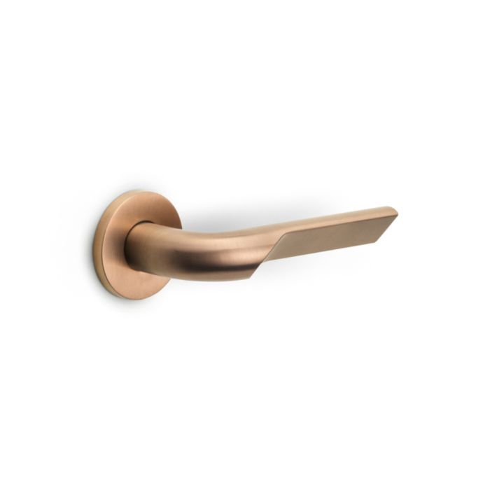
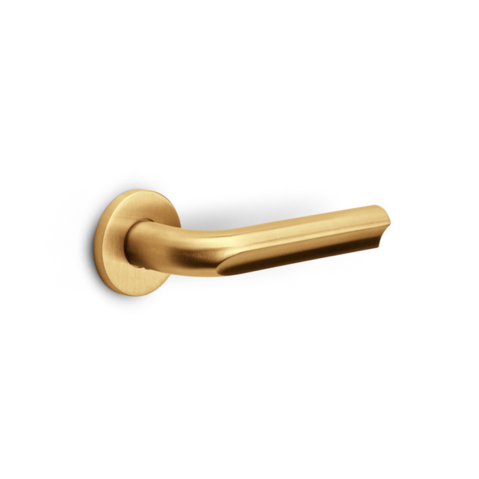
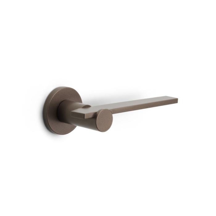
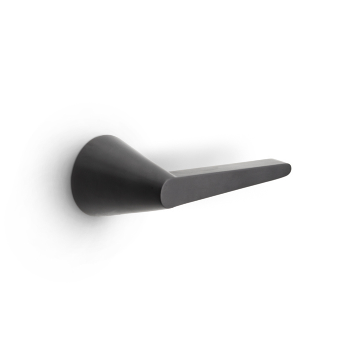
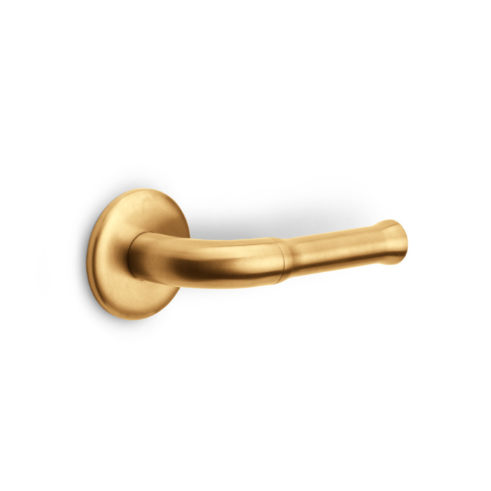
At FORMANI, we share this vision. Colors, or finishes as we call them, have always been a vital part of our product development. We've created a beloved palette by meticulously following and continuously improving color usage trends in interior design. Our extensive palette includes traditional steel shades, various dark tones like black and bronze, light colors like white, and warm or earthy hues like gold and copper. Collaborations with leading designers and studios like Studio Piet Boon, who set rather than follow trends, have enabled us to develop a stylish and timeless palette that remains relevant for years.

Creating a Color Palette
We asked Jesseca van Haneghem about her approach to creating a color and material palette. "Various factors influence the palette's composition, and a thorough analysis of these influences and client desires is the first step," says Jesseca. For instance, the location plays a role: "For a city apartment, you might choose different colors than for a vacation home in Portugal." Factors such as room size and ceiling heights also matter. In a city apartment, subtle, understated shades can make the limited space appear larger, while a vacation home in Portugal invites the use of vibrant colors that enhance the summery feel. It's crucial that the palette is not only aesthetically pleasing but also perfectly suited to the location and use of the space.
Jesseca also emphasizes the importance of seasons and natural light in creating a palette. At the studio, they work with large tables and light sources that mimic natural daylight. "We build material palettes on these tables. Sometimes we walk through the studio with samples to see how different light affects them," she explains. This practice helps to get a realistic view of how colors and materials will look under different lighting conditions, which is essential for creating a harmonious and attractive space.
At FORMANI, we understand how light affects the color of our products. Developing a beautiful finish can be quick, but the real challenge lies in maintaining this color consistency across our entire collection. Our collection includes door, window, furniture hardware and accesoires, and ensuring a uniform tint across all surfaces, whether cylindrical parts of door handles or flat surfaces of shields or rosettes, is challenging. We examine products under different lighting conditions and adjust the finish until we achieve a perfect result for the complete concept. Only then do we add the color to our strong palette, contributing to a harmonious look.


Subtle Shades and Dynamic Layering
Studio Piet Boon has a clear brand identity that is evident in all their projects, according to Jesseca van Haneghem. The color palettes are built from this brand identity, meaning the base palette remains calm with subtle shades. This palette is enriched by adding layers with different textures and materials in the same color. When color is added, for example, they might choose a striking natural stone for a side table, combined with accent pillows and artworks in more vibrant colors. This results in a dynamic yet cohesive look.
According to Jesseca van Haneghem, the color palette of Formani excellently aligns with their brand identity. The palette focuses on sustainable finishes and offers a wide range of subtle shades that can still be used in a pronounced manner. This palette provides the flexibility to seamlessly integrate various textures and materials, ensuring a harmonious and stylish appearance in every space.
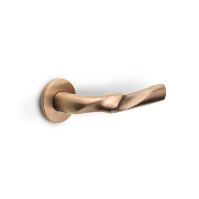
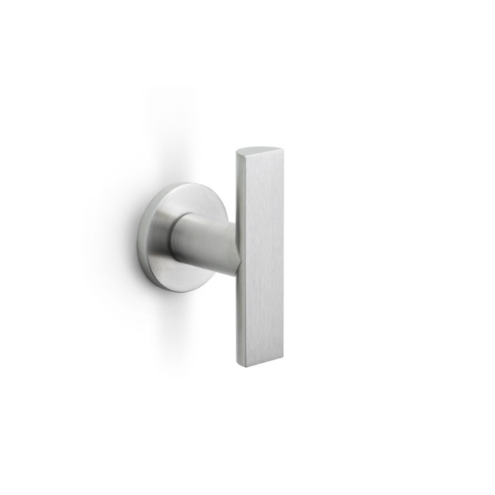
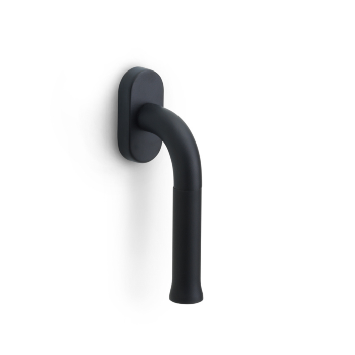
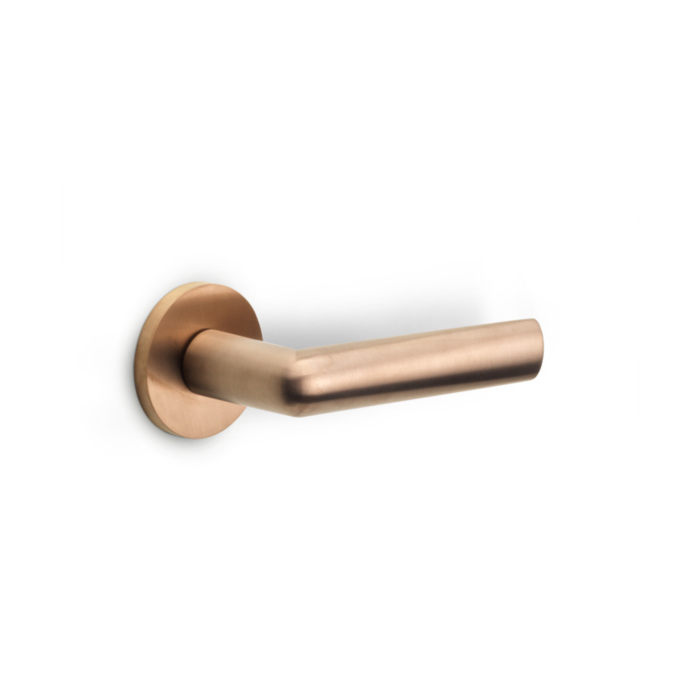
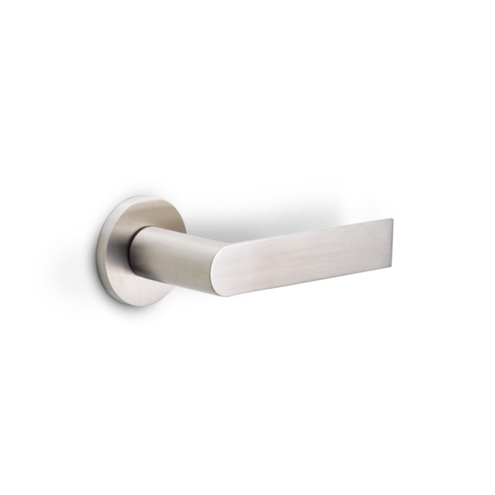
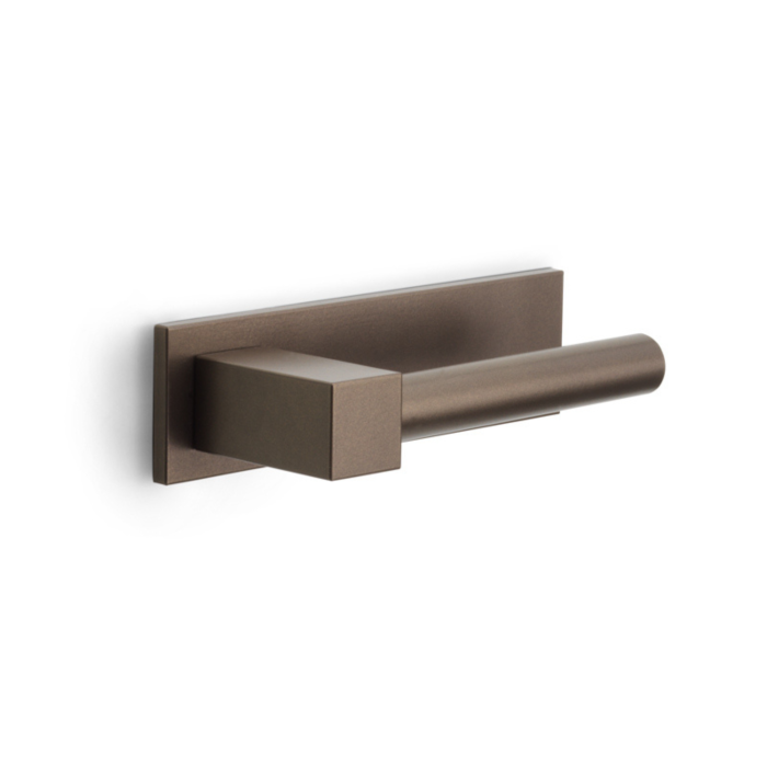
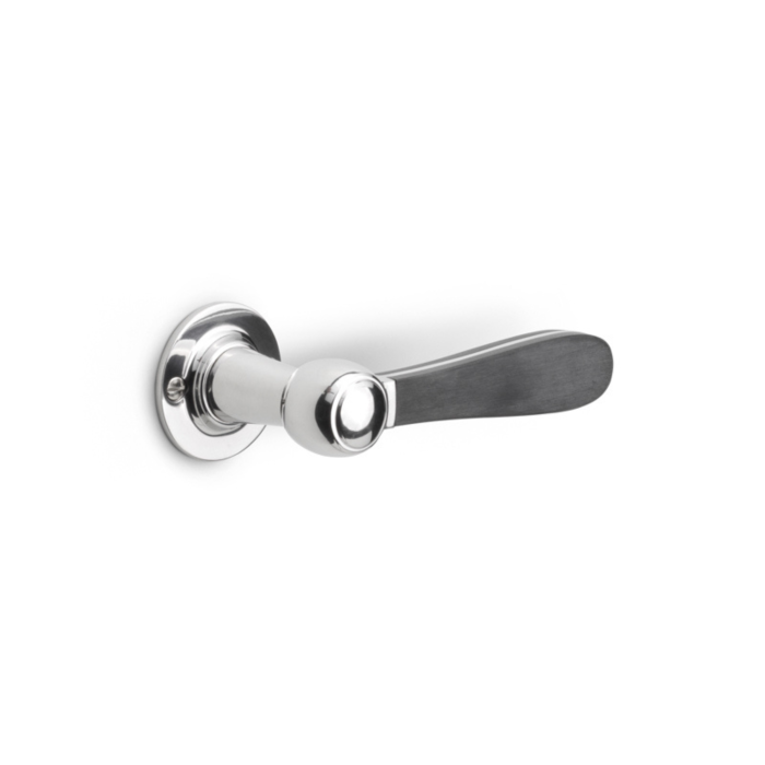
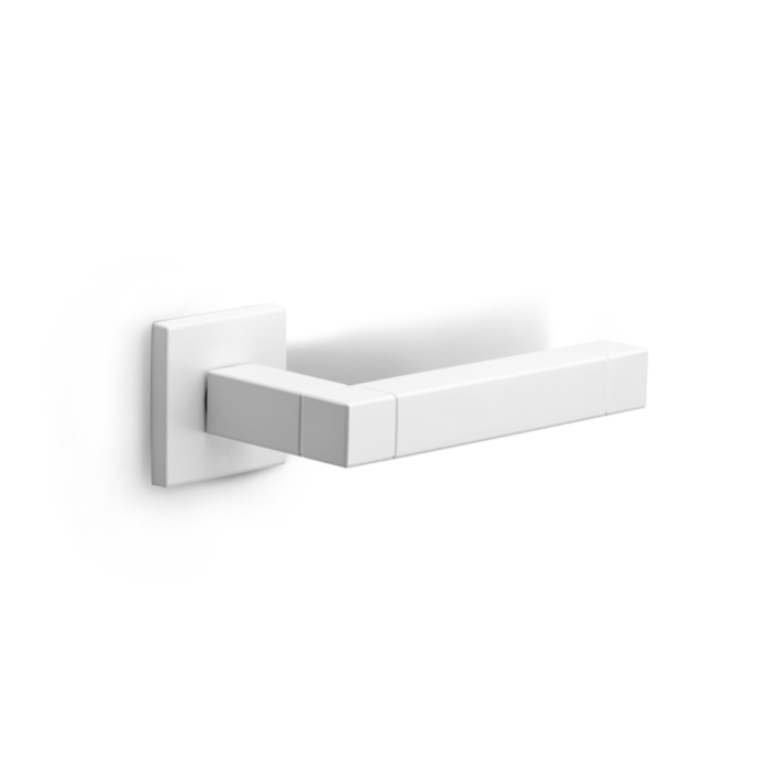
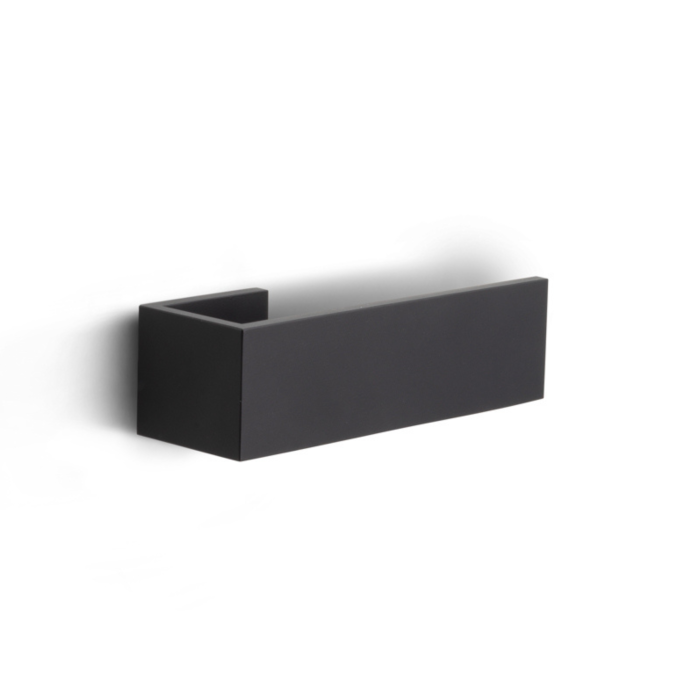
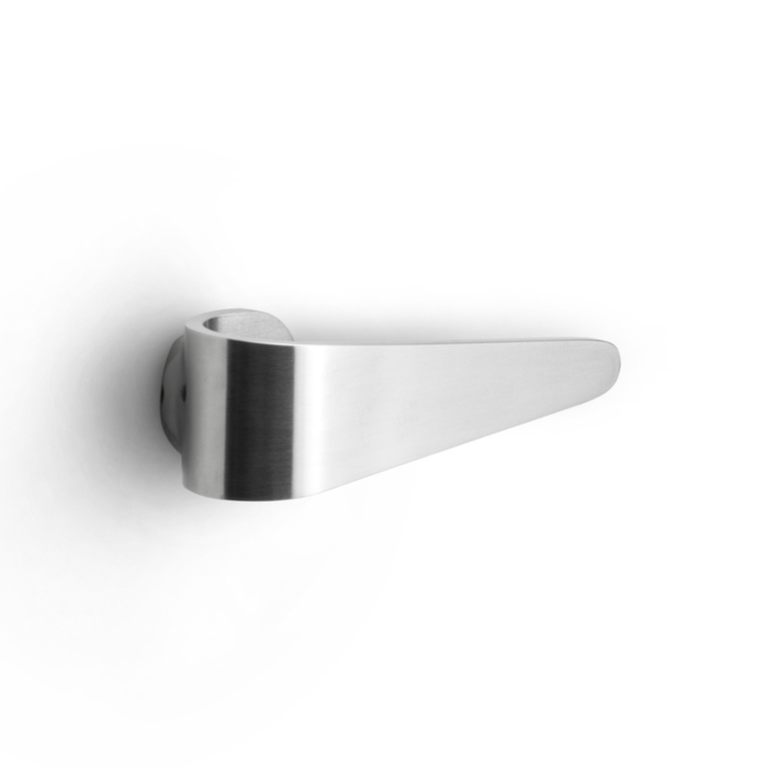
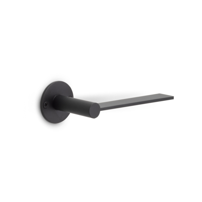
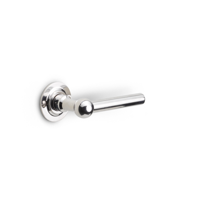
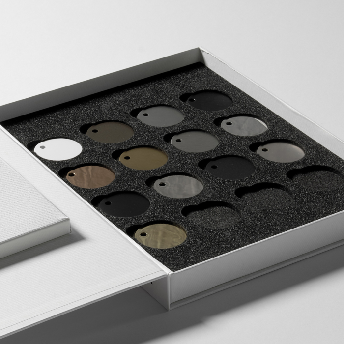
The FORMANI color palette fundamentally consists of 16 different finishes, with a 17th on the way. Despite the diversity, the complete palette includes subtle colors and shades. Think traditional steel-colored finishes, the popular black and bronze, but also white, gold, polished, and copper. Within these basic colors, there are different shades created by various finishing techniques. For example, a powder coating in black has a different look than a matte black PVD finish. Copper is available in a polished finish for a classic look, but also in a matte PVD finish for a more modern appearance. Bronze was currently only available in a deep, dark earthy shade, but our new PVD finish introduces a lighter alternative.
Combining Materials
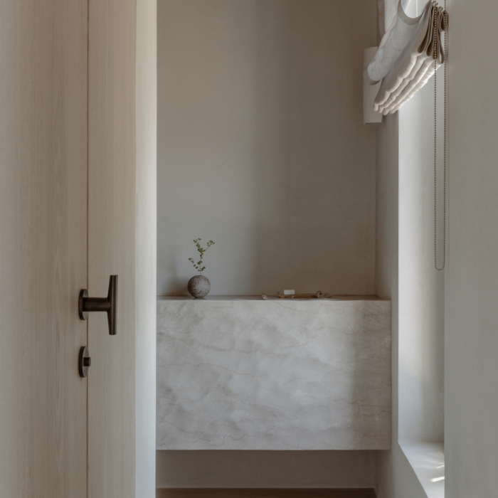
Jesseca van Haneghem emphasizes that integrating different materials within a single palette is an art in itself. "In the studio, we work a lot with textures such as wood, plaster, gloss, matte, and natural stone. All these materials belong to the same color family," she explains. By combining various textures, materials, and finishes, a space can gain depth and character without appearing chaotic. This results in a dynamic yet cohesive design.
Combining different wood types also poses a challenge. It's essential that both the fixed custom furniture and the freestanding pieces are well-matched. Additionally, it's crucial that the door hardware, taps, and accessories harmoniously connect. This attention to detail ensures a coherent and stylish whole.
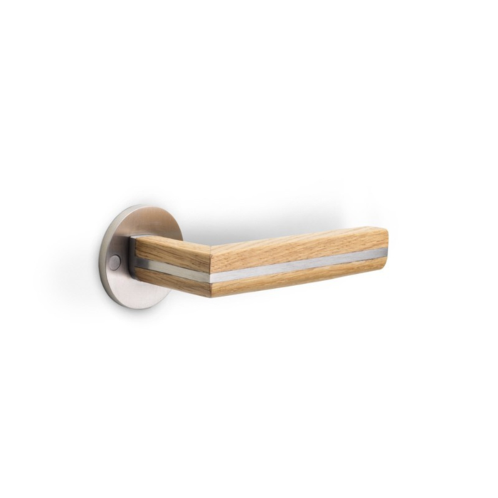
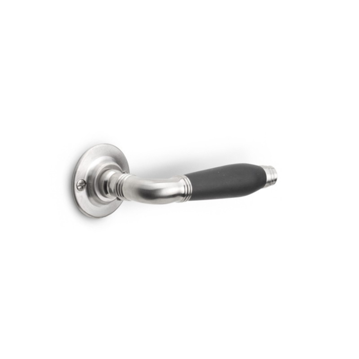
Within the FORMANI collections, other materials are also combined along with the base colors. In the TWO collection by Piet Boon, for instance, stainless steel is paired with oak (natural or black). Another collection is expanded with Carrara marble for a luxurious, classic look. These add-ons make a specific collection unique and add exciting details.

Integration of Door and Furniture Hardware in a Color Palette
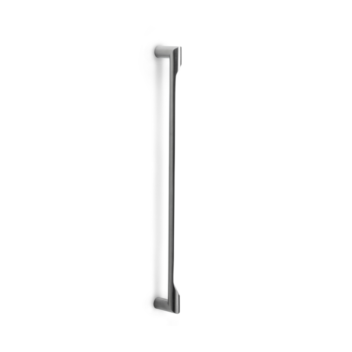
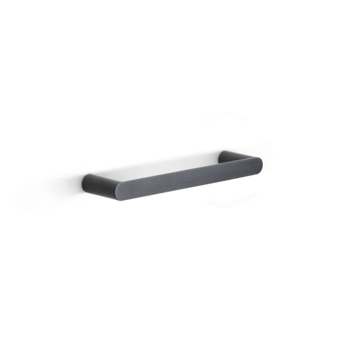
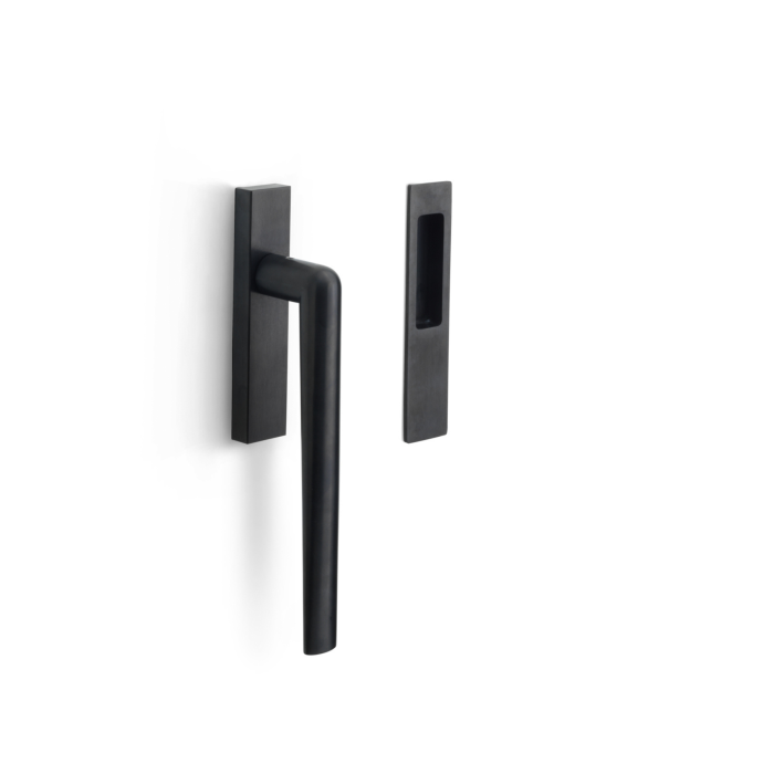
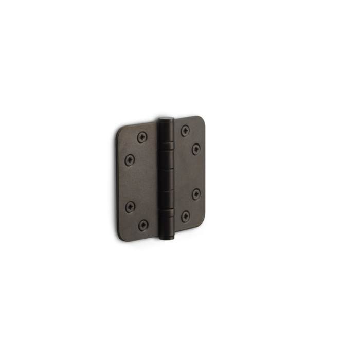
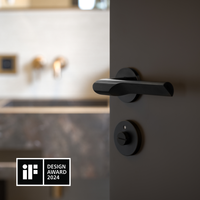
The choice of door hardware and other architectural hardware is made during the color palette assembly. Although it seems like a small detail, these elements significantly impact the overall aesthetic. Like taps, they are crucial details that can make or break a design and set the tone. Choosing black can make a project tougher and more modern, while stainless steel blends more into the palette and provides less contrast. "We usually integrate door hardware and taps in the same color," says Jesseca van Haneghem. This ensures consistency and a harmonious appearance throughout the design.
Selecting the right door handles and hardware goes beyond aesthetics; they must also be functional and fit the overall style of the project. Textures and finishes also play a crucial role in selecting door hardware. "Generally, the color is decisive. But in projects where you deal with weather influences, you make different choices." For outdoor projects, for example, durable and weather-resistant materials such as PVD coatings may be chosen, while more variety in finishes is possible for indoor projects.
The FORMANI sample program significantly contributes by allowing designers and architects to explore various materials, finishes, and colors and to combine them. This program aids in making well-considered choices that enhance both the aesthetics and functionality of a project. These careful considerations ensure a perfectly balanced and stylish design.

Discover the new PVD light bronze finish, soon available in the FORMANI collections
Asked about the current popular trends in colors, Jesseca van Haneghem replies, "We have been using a lot of beige and earth tones for a long time. In terms of door hardware, we often opt for bronze or black for a tough contrast. Warmer colors are also increasingly being applied. Especially in vacation homes in Portugal and Spain, we see more and more bronze, copper-colored, and gold-colored finishes."
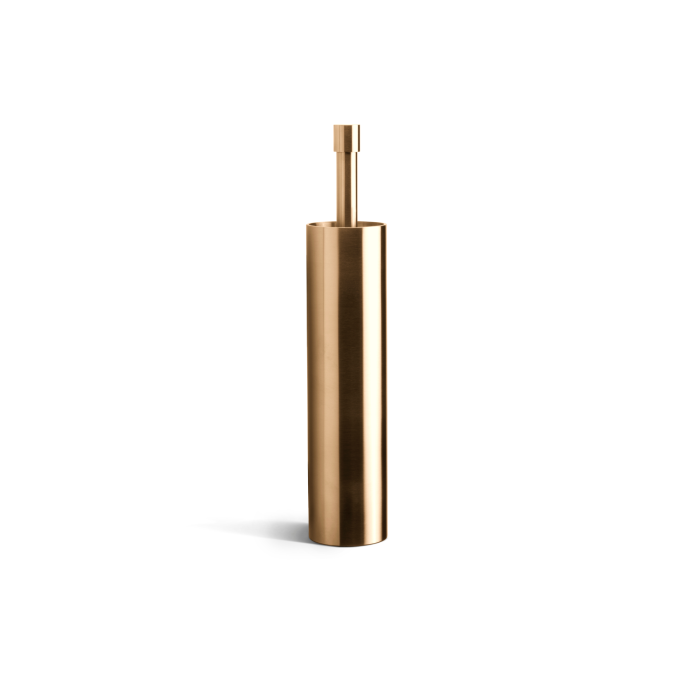
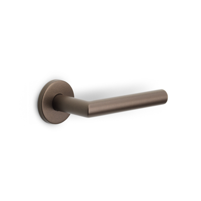
In line with these trends, FORMANI soon offers an exciting new addition: the PVD light bronze finish. This new finish promises a fresh, modern twist to classic bronze shades. PVD light bronze combines durability with a luxurious appearance, perfect for both indoor and outdoor projects. Thanks to the weather-resistant properties of the PVD coating, this finish not only remains beautiful but also functional under various conditions.
Deze nieuwe finish zal beschikbaar zijn voor diverse Piet Boon collecties, waaronder ONE, INC en ARC. Daarnaast kunnen ook de RIVIO, ECLIPSE en bepaalde modellen in de BASICS collectie profiteren van deze prachtige nieuwe afwerking. Houd onze updates in de gaten voor meer informatie over deze toevoeging en hoe deze kan bijdragen aan uw volgende ontwerp. De PVD licht brons finish is een voorbeeld van hoe FORMANI blijft innoveren en inspireren, door hoogwaardige materialen en verfijnde esthetiek samen te brengen.

